CSS “height:100%”, it does not work ! How to use CSS height Property.
CSS , web , web design
CSS “height:100%”, it often does not work ! so I studied again how to use css height Property.
In order to organize what I have studied, I think trying to article.
Point was the difference of the specified method according to the unit!
The main unit of css height property.
The following three units are often used for css height property.
px(pixels)
%(percent)
vh(viewport height)
The specification method differs by the unit.
If you do not specify height property correctly, it will not work.
In this article, I will explain how to use of the three units based on sample code.
The specification method differs between px and %.
“px” is specified by absolute value, “%” is specified by relative value.
If you specify %, it means relative value, that is, a percentage relative to the parent element, so also specify height property for the parent element.
Since px is a designation by the absolute value, it will be displayed as specified even if there is no height property to the parent element.
px and %, I am a tend to confuse the specification method. When the specified percentage, if you do not specify the height to the parent element, “height:100%” does not work!
POINT
Css height property is specified method is different in px and %
px is an absolute value, % is specified as a relative value
When you specify a percentage specifies the height to its parent element!
Let’s take a look at specifically.
When specified in px (pixels)
See the Pen KLZOXE by natsuki (@natsukimemo) on CodePen.
<html>
  <head></head>
  <body>
    <div class="sample01">
      sample01
    </div>
  </body>
</html>
*{
  margin:0;
  padding:0;
}
.sample01{
  background-color:#f00;/*red*/
  color:#fff;
  width:200px;
  height:250px;
}
Fourth row from the first row of the CSS is, in the description of the order to eliminate the difference in the gap by the browser, and the gap to zero.
Since the swerve and the theme of this article explanation is omitted, but it is often first on the description of the css.
In the fifth line after the CSS, background red div.sample01, width 200px, and to specify the height 250px, are displayed in the street.
When you specify a percentage (percent)
See the Pen NVXQyE by natsuki (@natsukimemo) on CodePen.
<html>
  <head></head>
  <body>
    <div class="sample02">
      sample02
    </div>
   </body>
</html>
*{
  margin:0;
  padding:0;
}
.sample02{
  background-color:#f00;/*背景赤色*/
  color:#fff;
  width:200px;
  height:100%;/*←ここだけsample01と違う*/
}
The above sample02 is the same as the code of sample01, it has been changed in height by 100%. (Line 9 of the above-mentioned CSS)
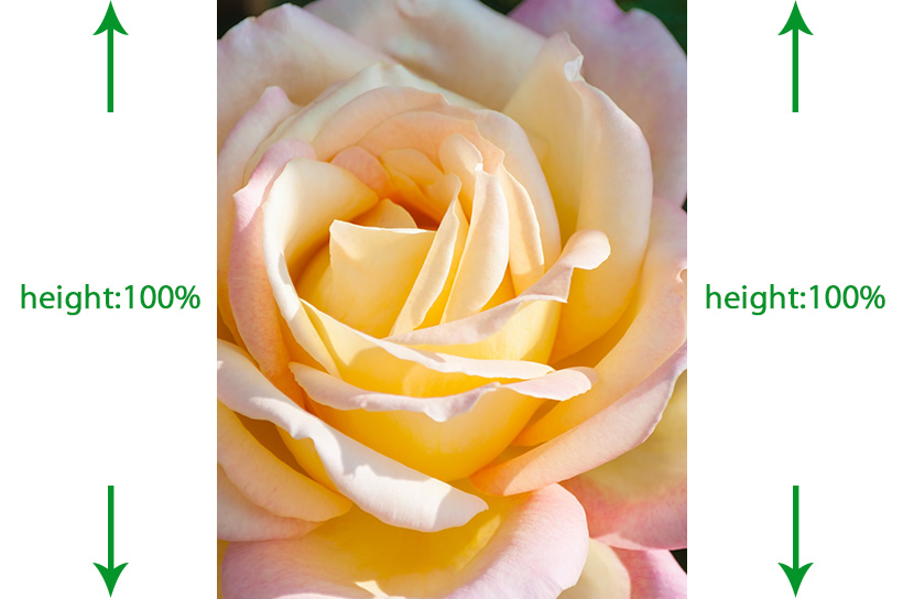
if you try to view the background color red to the full height of the frame, height: You specified a 100%, I do not have worked.
So how do I to display to the full height of the frame as intended the sample02?
It is,percent because it specifies a relative value, to specify the height to the parent element.
% In the specified, so also in the parent element to specify the Height
(Px and%, when using both units)
See the Pen GaxNbe by natsuki (@natsukimemo) on CodePen.
<html>
  <head></head>
  <body>
    <div class="wrap">
     <div class="sample03">
       sample03
     </div>
    </div>
   </body>
</html>
*{
  margin:0;
  padding:0;
}
.wrap{
  background-color:#00f;/*背景青色*/
  width:300px;
  height:250px;/*←ピクセルで指定*/
}
.sample03{
  background-color:#f00;/*背景赤色*/
  color:#fff;
  width:200px;
  height:100%;/*←パーセントで指定*/
}
The above sample03 is obtained by adding a div.wrap the html code of the previous sample02.
div.wrap is, the parent element of div.sample03will be called.
CSS has added the designation of div.wrap in the ninth row from the fifth row.
I want to note here is, Height to CSS8 line div.wrap: specified by 250px and the pixel has been furtherline 14, the div.sample03 height: specified by 100% and the percent is where you are.
Looking at the above-mentioned display a result, height of div.wrap (blue): to 250px, the height is 100% of which is a child element div.sample03 (red) (overlaps with the blue) are displayed.
In other words, since designation of at px is a designation by the absolute value, thateven the parent element no heightappears in 250px, since designation of a percentage is a designation by a relative value, of Div.Sample03100% of the parent element div.wrap in it is displayed.
height: Use the 100%, to display to the full height of the window
So, do you do to display to the full height of the window.
It is, to all the parent element height: Specify a 100%to.
See the Pen dEdPQz by natsuki (@natsukimemo) on CodePen.
<html>
  <head></head>
  <body>
    <div class="wrap">
    <div class="sample04">
      sample04
    </div>
       </div>
  </body>
</html>
*{
  margin:0;
  padding:0;
}
html{
  height:100%;
}
body{
  height:100%;
}
.wrap{
  height:100%;
}
.sample04{
  background-color:#f00;
  color:#fff;
  width:100%;
  height:100%;
}
Also in body tag to div.wrap, which is the parent element of div.sample04, also in html tag height: Specifies the 100%.
The above has to nest of div.wrap, but the body tag and the html tag if described immediately below the body tag hegiht: Specifies the 100%.
POINT
height: Use the 100%, how to display to the full height of the window
To all the parent element height: Specify a 100% to.
In the case of the image Note) Width above sample04 the background color: 100% and although the width also has become a full-screen red because it is specified to 100%, in the case of an image, left-justified or been distorted in the above code it may become gone to. How to display the image in the center to full-screen, see, if good, because I am writing in a different article.
“The image to fill the screen (full-screen) HTML and CSS to display” -NATSUKIMEMO
When specified in the vh
vh is an acronym for “viewport height”, is a unit that specifies the height of the viewport.
The viewport that of the display area of the window, the number in the display area for each it is also different devices such as the unit is specified to a PC or smartphone the vh is calculated.
height: 100vh; and it specifies that the 100% height of the display area, is.
In responsive units active in the device with a variety of sizes, such as smartphone and tablet, easy to say and height: If you specify a 100vh, but trying to horizontal, but tries to the orientation of the smartphone in a vertical, an element to the full height of the browser us with display.
sample05 below, it has been displayed in the height full of vh.
See the Pen vwjOMa by natsuki (@natsukimemo) on CodePen.
<html>
  <head></head>
  <body>
    <div class="sample05">
      sample05
    </div>
  </body>
</html>
*{
  margin:0;
  padding:0;
}
.sample05{
  background-color:#f00;
  color:#fff;
  width:300px;
  height:100vh;
}
In CSS9 Line height: specify the 100vhwe are.
I want to note here,is that you do not specify a height to the parent element .
This is because, in the case of the viewport, some percentage with respect to the display area ,it means that you do not need to specify the parent element.
If you specify the height to the parent element, it is ignored, it is height is calculated on the basis of the window is the only display area.
sample06 below specifies the height in px to the parent element div.wrap.
See the Pen qGLmPK by natsuki (@natsukimemo) on CodePen.
<html>
  <head></head>
  <body>
    <div class="wrap">
     <div class="sample06">
      sample06
     </div>
    </div>
  </body>
</html>
*{
  margin:0;
  padding:0;
}
.wrap{
  background-color:#00f; /*背景青色*/
  width:400px;
  height:200px;
}
.sample06{
  background-color:#f00; /*背景赤色*/
  color:#fff;
  width:300px;
  height:100vh;
}
The above CSS8 line, to div.wrap height: the 200px, height to div.sample06 at line 14: specifying 100vh.
div.sample06 ignore the 200px of the parent element, you have to display the background red to the full height of the window.
POINT
Unit viewport is to specify, some percentage with respect to the display area
vh is even with height in the parent element, it does not reference, the height is calculated on the basis of the window is a display region.
vh is, in a convenient unit that allows you to specify the height to the window without the parent element, child element care, there is also a unit that specifies the width of vw (viewport width).
More than it is the use of the height that I understand, specified in% is Toka … in absolute value px is a relative value, but just that being said try and commonplace, forget carelessly, without noticing or rather I think I’ll be coding in.
This article, we hope and serve you something.